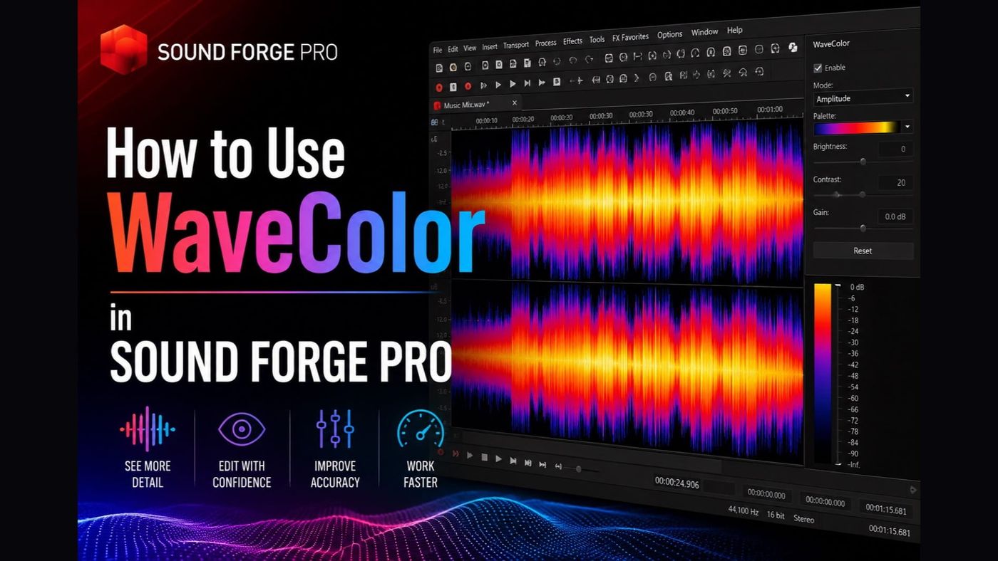
WaveColor is a display mode in Sound Forge Pro that adds color coding to the waveform based on the audio's tonal characteristics. Instead of a monochrome waveform showing only amplitude, WaveColor maps pitch and sound characteristics to different colors and saturation levels across the waveform display. The result is a view where the frequency content of audio is visible at a glance without running a spectrum analysis or pressing play.
Part of the Sound Forge Pro 2026 Guide — start there if you're new to the editor.
This guide is part of the Sound Forge Pro Audio Restoration hub. Start there if you need the full order: spectral diagnosis, WaveColor checks, broadband noise, clicks and pops, noise gate and RX escalation.
It's not a processing tool — WaveColor doesn't change the audio, it changes how the audio looks. The value is navigational: identifying anomalous events in a file (clicks, crackle, noise), checking the noise floor visually, and getting a rapid overview of what's happening in different sections of a long file before you start editing.
Quick answer: View → WaveColor to toggle it on and off. WaveColor is available in Sound Forge Pro 14 and later. The rest explains what the display shows, where it's useful in practice, and its limitations compared to the Spectrum Analysis tool.
How to Enable and Disable WaveColor
Go to View → WaveColor to enable the color display. The standard monochrome waveform changes to a color-coded version across the data window. Toggling it off — same menu path — returns the waveform to monochrome. Both directions are instant, no processing required.
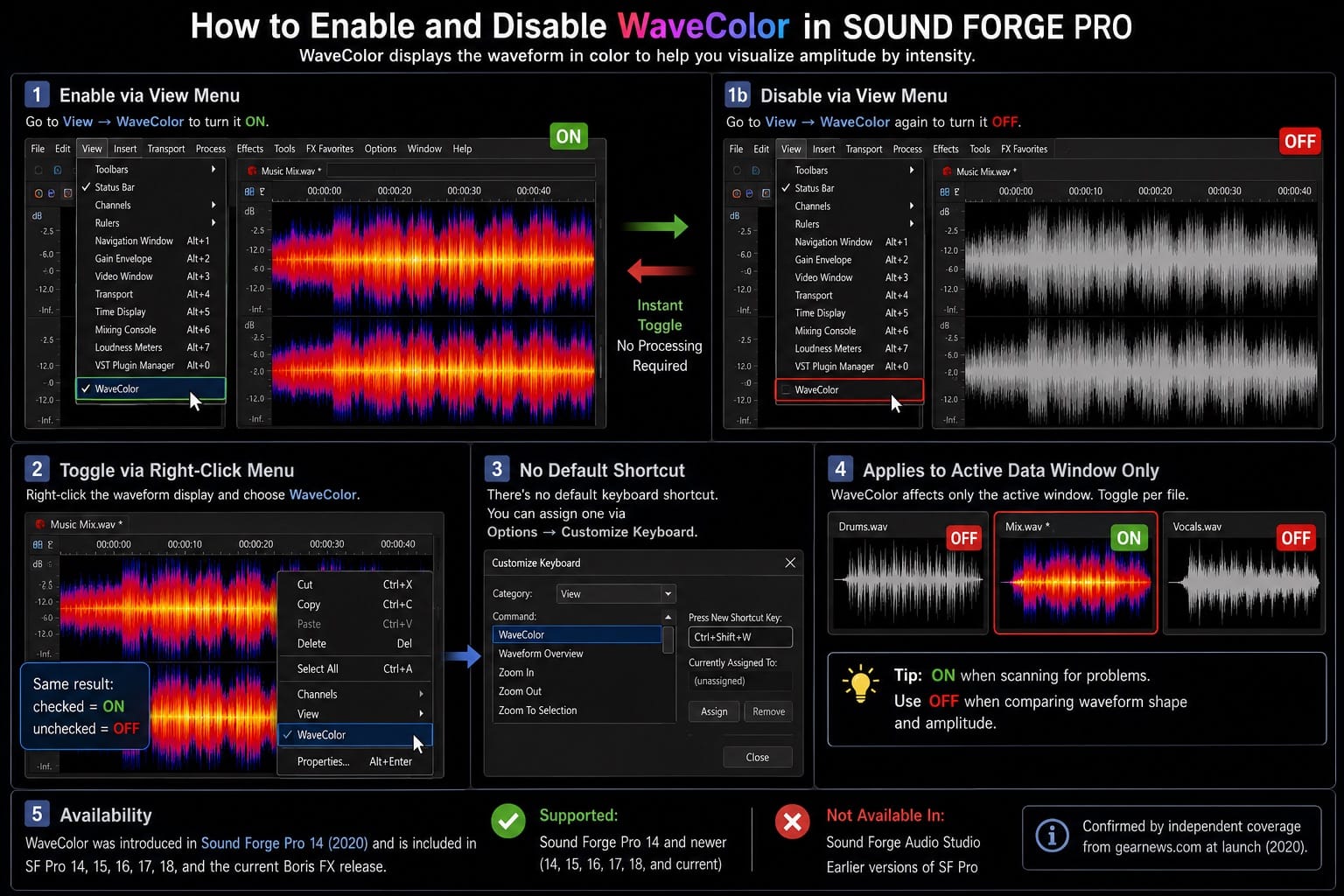
WaveColor can also be toggled via right-click on the waveform display — the context menu includes a WaveColor option. There's no dedicated keyboard shortcut by default, but you can assign one through Options → Customize Keyboard if you use it frequently.
The display applies to the active data window only. If you have multiple files open in separate data windows, enabling WaveColor in one doesn't change the others. Toggle it per-file as needed. On a typical editing session with five or six files open, I leave WaveColor on for the file I'm scanning for problems and off for files I'm comparing by waveform shape — the monochrome display makes amplitude differences easier to see for that purpose.
WaveColor was introduced in Sound Forge Pro 14, released in 2020 — confirmed by independent coverage from gearnews.com at launch. It's present in all subsequent versions including SF Pro 15, 16, 17, 18, and the current Boris FX release. It's not available in Sound Forge Audio Studio or earlier versions of SF Pro.
What WaveColor Shows: Pitch, Character, and Saturation
The official description from the Sound Forge Pro feature page and Boris FX documentation: WaveColor assigns colors based on pitch and sound characteristics, with saturation indicating intensity — louder or more spectrally rich sections appear more vivid. You can see frequency content across the waveform without opening Spectrum Analysis or pressing play. Different sections of audio with different dominant frequencies appear in different colors. A vocal with consistent pitch center shows consistent hue across its length. A section of broadband noise looks different from a section of tonal content. A transient click or pop — which contains a sharp, anomalous frequency spike — appears as a distinct color event standing out from the surrounding material.
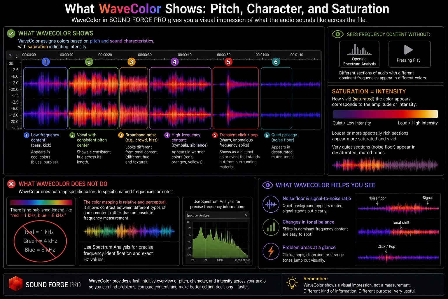
What WaveColor does not do: it doesn't map specific colors to specific named frequencies or notes. There's no published legend saying "red = 1 kHz, blue = 8 kHz." The color mapping is relative and perceptual — it shows contrast between different types of audio content rather than an absolute frequency measurement. For precise frequency identification, the Spectrum Analysis tool (View → Spectrum Analysis) gives exact Hz values. WaveColor gives a visual impression of what the audio sounds like across the file, which is a different kind of information and useful for different purposes.
The saturation of the color (how vivid vs muted the color appears) corresponds to the amplitude or intensity of the audio content at that point. Louder sections appear more saturated. Very quiet sections — like the noise floor between sentences — appear in desaturated, muted tones. This makes the noise floor and the signal-to-noise ratio visible at a glance without measuring.
Using WaveColor for Click and Crackle Detection on Vinyl
This is the most practical use of WaveColor for most restoration work. On a vinyl transfer, clicks and crackle appear as distinct events in the waveform, but at standard zoom levels they can be difficult to spot in a monochrome display because the amplitude spike of a small click can be hidden inside a loud musical passage. WaveColor makes them more visible because a click has a different tonal character from the surrounding music — its color stands out from the waveform color of the surrounding audio.
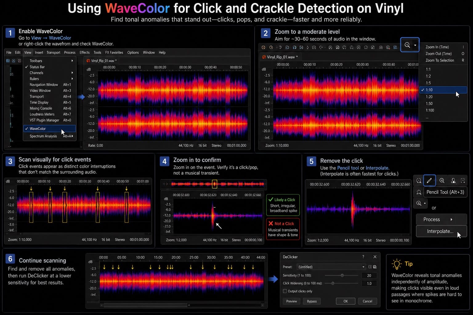
The workflow: enable WaveColor, zoom to a moderate level where you can see 30–60 seconds of audio in the window, and scan visually along the waveform. Click events appear as distinct color interruptions — sharp events that don't match the surrounding hue. When you see one, zoom in to confirm it's a click and not a legitimate musical event, then remove it with the Pencil tool or Interpolate.
On a 44-minute vinyl rip of a classical piano recording last spring, WaveColor scanning at 1:10 zoom caught 14 click events before I ran the automatic DeClicker — bright color interruptions in what was otherwise consistent tonal material. Some of those clicks were in loud passages where the waveform amplitude spike wasn't obviously distinguishable from the surrounding dynamics in monochrome display. WaveColor made the tonal anomaly visible independently of the amplitude. After manually addressing those 14, the DeClicker pass ran with a lower sensitivity setting because the most obvious transients were already handled, reducing the risk of false positives on the piano's attack transients. Full vinyl restoration workflow is in the vinyl restoration guide.
Using WaveColor to Check Noise Floor
The saturation mapping in WaveColor makes the noise floor visually readable without running Statistics or listening through headphones. In a clean recording, the sections between speech or music — the pauses — appear as desaturated, low-intensity color regions that are distinctly quieter than the active audio sections. In a recording with a significant noise floor, those same pauses appear with more saturation, showing that the noise floor carries enough energy to register as a colored event rather than near-silence.
Open the file, enable WaveColor, and look at the pauses between content. If the quiet sections look almost as vivid as the loud sections in terms of color saturation, the noise floor is high enough to need treatment before delivery. If the pauses look clearly desaturated — muted and low-intensity compared to the audio — the noise floor is likely within acceptable range.
It's a qualitative check, not a quantitative one. For delivery verification — hitting ACX's -60 dBFS RMS requirement or podcast's -60 dBFS noise floor — use Tools → Statistics on a selected quiet section to get the actual number. WaveColor tells you "there's probably something here worth checking" rather than giving you the measurement that confirms whether it passes. I use it as a first pass that decides whether to run Statistics at all.
WaveColor vs Spectrum Analysis: Different Tools for Different Questions
WaveColor and the Spectrum Analysis window (View → Spectrum Analysis) both give you information about the frequency content of audio, but they answer different questions and work at different scales.
WaveColor covers the whole file at once. You can see the entire 30-minute narration with WaveColor on and immediately spot sections that look different from the rest — a room change, a section with more noise, a cluster of clicks on a vinyl record. It's a file-level overview tool that operates in the waveform display you're already looking at.
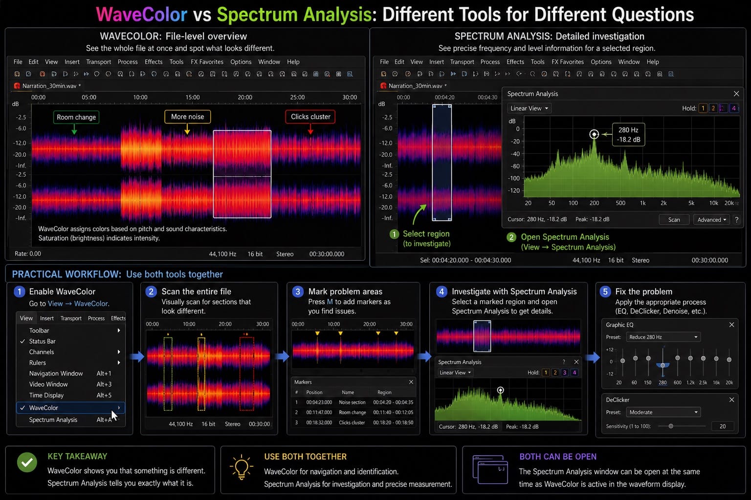
Spectrum Analysis covers a selected region in depth. You select a few seconds of audio, open the Spectrum Analysis window, and get a precise frequency graph showing amplitude in dB at specific frequencies from 20 Hz to 20 kHz. It answers "exactly what frequency is this buildup at?" and "how loud is this specific frequency range?" — questions that WaveColor can't answer because it doesn't give absolute measurements.
The practical workflow is to use WaveColor for navigation and initial identification, then switch to Spectrum Analysis for investigation. WaveColor shows you that something looks different at 4 minutes 23 seconds. Spectrum Analysis tells you it's a 280 Hz buildup at -18 dBFS that needs a notch EQ cut. Using both together is faster than relying on either one alone.
On restoration sessions, I typically leave WaveColor on during the initial pass through the file — marking problem areas with the M key as I scan visually — then switch it off and open Spectrum Analysis when I'm investigating specific sections. The two tools don't conflict with each other; the Spectrum Analysis window can be open at the same time as WaveColor is active in the main waveform display. Full EQ workflow after frequency identification is in the EQ guide.
Display Preferences and WaveColor Customization
The base colors of the Sound Forge Pro interface — background, waveform, selection highlight — are configurable through Options → Preferences → Display. This includes the interface color theme (Dark, Medium, Light, White) and custom waveform and envelope colors. WaveColor renders within whichever base theme is active, so colors look different in Dark vs White mode.
On my own setup I've settled on the Dark interface theme with WaveColor on by default for new files — the dark background makes the color contrast more visible than the light themes. The Medium theme works similarly. Light and White themes reduce the color contrast of WaveColor noticeably because the lighter background competes with the hue saturation.
A known issue that appears in magix.info forum threads: in SF Pro 14 and 15, enabling WaveColor could cause the selection highlight to match the wave color rather than providing a distinct contrast, making it difficult to see what was selected. The fix for users experiencing this was to adjust the selection color in Options → Preferences → Display to a color that contrasts with the WaveColor palette — typically a neutral light grey or white selection highlight works better than the default selection color when WaveColor is active.
WaveColor does use additional GPU processing compared to the monochrome waveform display. On older hardware or integrated graphics, it can affect rendering speed when scrolling through or zooming into large files. If you notice sluggish response in the data window while WaveColor is on, toggling it off while doing fine edit work and back on for scanning passes resolves it without affecting the audio.
Frequently Asked Questions
Where is WaveColor in Sound Forge Pro?
View → WaveColor in the menu bar toggles the color waveform display on and off. You can also right-click the waveform display in the data window and choose WaveColor from the context menu. There's no default keyboard shortcut, but one can be assigned through Options → Customize Keyboard. WaveColor is available in Sound Forge Pro 14 and later; it's not present in earlier versions or in Sound Forge Audio Studio.
What do the colors mean in WaveColor Sound Forge Pro?
Different colors represent different pitch and tonal characteristics in the audio. The color hue varies with the sonic character of the audio — different dominant frequencies and timbral qualities appear as different colors. The saturation level (how vivid or muted the color is) corresponds to the intensity of the audio — loud sections appear more saturated, quiet sections more muted. There's no fixed legend assigning specific colors to specific frequencies; the color mapping is relative rather than absolute. For precise frequency measurements at specific values, use the Spectrum Analysis tool (View → Spectrum Analysis).
How does WaveColor help with click detection in Sound Forge Pro?
Clicks and pops have a different tonal character from the surrounding audio, so they appear as distinct color events in the WaveColor display — particularly useful when clicks fall inside loud musical passages where the amplitude spike isn't easily visible in a monochrome waveform. Enable WaveColor, zoom to a moderate level, and scan for color interruptions that don't match the surrounding material. Zoom in on suspect areas to confirm whether they're clicks before editing. The full click removal workflow, including DeClicker settings and manual Interpolate, is in the click removal guide.
Does WaveColor affect audio quality in Sound Forge Pro?
No — WaveColor is a display mode only. It changes how the waveform looks in the data window but doesn't apply any processing to the audio file. Enabling or disabling WaveColor has no effect on the audio, on any applied effects chains, or on the export output. It's a visualization tool, not an audio processor.
Can I use WaveColor with the Spectrum Analysis tool at the same time?
Yes — both can be active simultaneously. WaveColor applies to the waveform display in the main data window; the Spectrum Analysis window is a separate dockable panel. Having both open at once lets you use WaveColor for file-level navigation and color-based anomaly detection while using Spectrum Analysis for precise frequency measurement on selected sections. Having both visible at once costs nothing — they operate independently.
Is WaveColor available in Sound Forge Audio Studio?
No — WaveColor is a Sound Forge Pro exclusive feature. It was introduced in Sound Forge Pro 14 (2020) and is present in all subsequent Pro versions including the current Boris FX release. Sound Forge Audio Studio and earlier versions of Sound Forge Pro don't include WaveColor. The standard waveform display with configurable colors through Options → Preferences → Display is available across all versions.